|
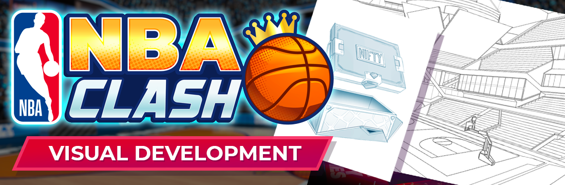
Early on in the development of NBA Clash we had the enviable opportunity to make something visually brand new. The goal was to hit stylized realism that felt athletic, energetic, playful, and striking. To lean into the star power of the NBA we explored exaggerated player portraits and body styles. Throughout development we emphasized the importance of unique visual identifiers for character art, UI, loot bags, and elsewhere. The visual distinction between asset silhouette, color, and motion were particularly important. While some of this never made it into the game they served as visual landmarks to rally to or against.


|
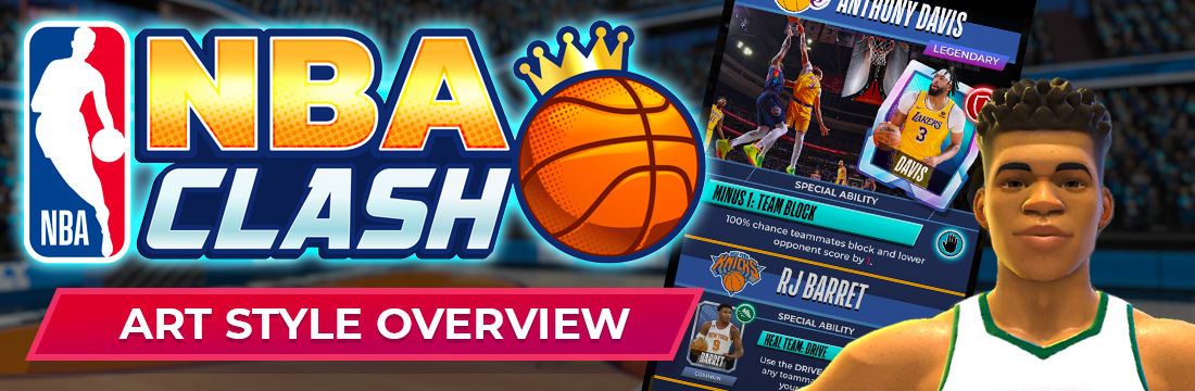
Below are samples from the NBA Clash Art Style Guide. The playful and sporty style is characterized by use of bright color for focal points, dark backgrounds with spot color, high-end/masculine/luxury materials, and Nifty flavored stylized realism with NBA swagger.


|
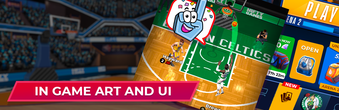
In Game Art and UI
Game art and UI were made by the talented artists at Nifty. The look and feel of the game really took off when the character, UI, and VFX animations came to life. We emphasized key "celebration moments" throughout to focus, surprise, and delight the user.


|


